
CLOUDFIT

Revised an existing AI fitness app, establishing comprehensive UI guidelines for the creation of CloudFit. This newly redesigned fitness application incorporates AI technology to provide personalized experiences. The project involved the development of a complete app prototype, which effectively addressed UI/UX challenges and facilitated efficient data entry through AI integration. The outcomes included increased user engagement, improved user retention, and successful integration with wearables, demonstrating the app's tangible impact on users' fitness goals.
ROLE: LEAD DESIGNER
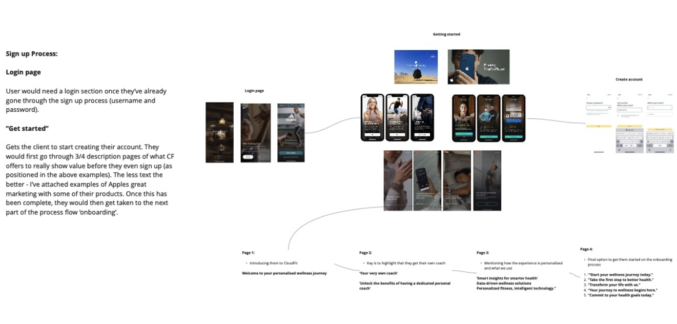
-
CloudFit is an innovative fitness application that leverages advanced AI technology to revolutionize users' fitness journeys. The app continuously studies and comprehends users' training routines, preferences, and progress, providing personalized insights and recommendations to optimize their path toward achieving fitness goals.
-
The existing fitness app concept provided lacked any form of UI or UX flow. It struggled to provide tailored fitness plans, real-time feedback, and interactive coaching experiences. The goal was to bridge this gap and develop a fitness app that could simulate human interaction through AI while efficiently guiding users to reach their fitness objectives.
-
To Implement a brand UI design that seamlessly aligns with the overarching vision of the brand, ensuring a cohesive and visually appealing user experience. Additionally, adopt an iterative development approach, allowing for continuous improvements informed by valuable user feedback to refine and enhance the app's functionality and user satisfaction.
-
Agile Principles: Guid the process, enabling flexibility and collaboration.
Sprint-Based Iterations: Two to four-week cycles for continuous improvement.
User Stories and Features: Framed tasks around user needs, aiding prioritization.
Continuous User Feedback: Iterative testing for user-centric refinements.
Cross-Functional Collaboration: Close interaction among myself, devs, stakeholders and fitness coaches.
Adaptive Design Guidelines: Flexible guidelines evolving with feedback.
Regular Design Reviews: Team sessions for alignment and feedback incorporation.
Prioritized Backlog: Task backlog based on project goals and user feedback.
Documentation and Sharing: Comprehensive records and knowledge dissemination.
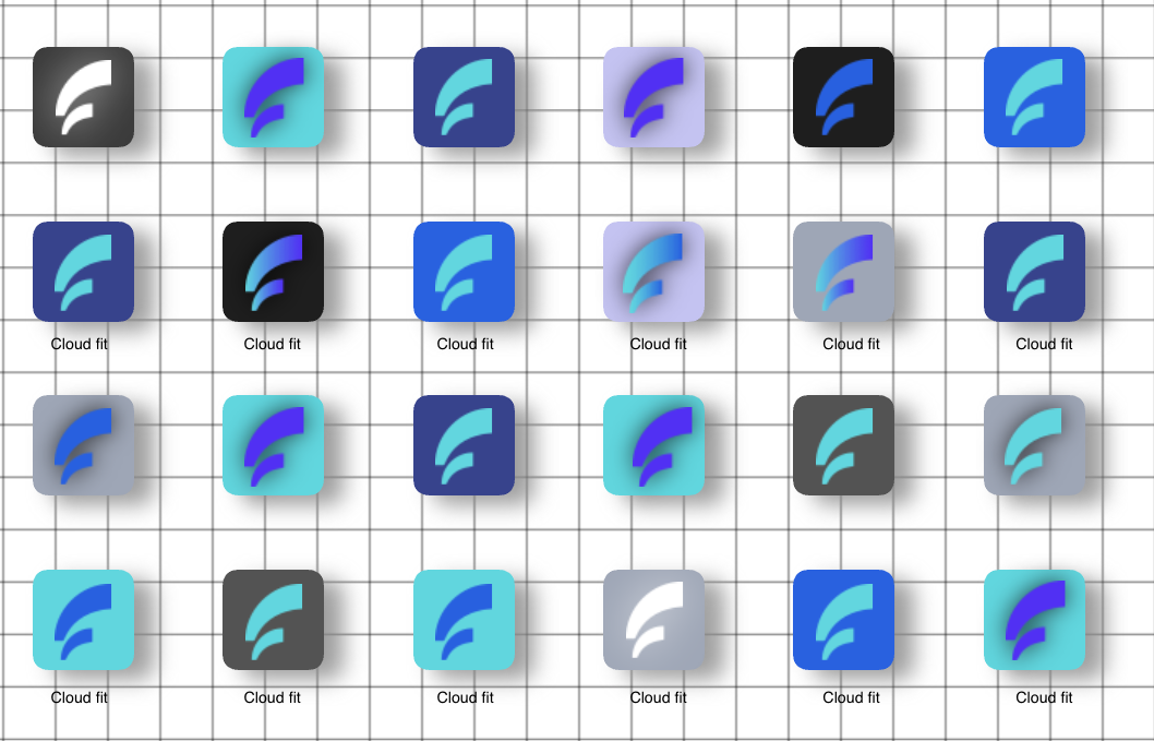
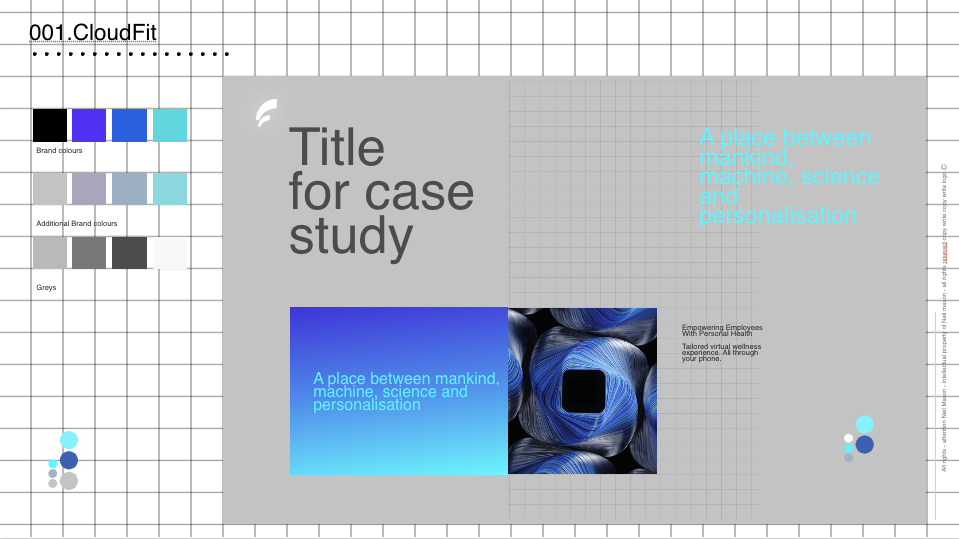
INITIAL BRAND


APP INSPIRATION


-
Mapped user experiences through the app, identifying key touchpoints and pain points.
Analyzed user interactions from onboarding to goal achievement to enhance the UX.
-
Conducted in-depth interviews with personal coaches to understand coaching dynamics.
Integrated insights into app design, aligning AI features with personalized coaching approaches.
-
Conducted a thorough analysis, benchmarking against other fitness apps for feature comparison and best practices.
Identified areas of improvement to ensure CloudFit stands out in terms of user experience and functionality.
UX/UI RESEARCH


OKR’s

-
Metric: Wearable Integration Adoption Rate
Measurement: Monitor the percentage of users who integrate the app with their fitness wearables, showcasing the success of this feature. -
Metric: Development Timeline Adherence
Measurement: Compare the planned development timeline with the actual timeline to identify any deviations and delays, ensuring timely delivery. -
Metric: Net Promoter Score (NPS)
Measurement: Conduct NPS surveys to gauge user satisfaction and the likelihood of users recommending the app to others. -
Metric: User Progress and Goal Achievement Rate
Measurement: Track and analyze the progress of users towards their fitness goals, comparing their initial status with achievements made using the app.
-
Metric: User Engagement Rate
Measurement: Measure the average time users spend on the app, the frequency of app usage, and the interactions with personalized recommendations. -
Metric: App Retention Rate
Measurement: Monitor the percentage of users who continue using the app over a specified period, indicating satisfaction and engagement with the seamless AI integration. -
Metric: User Feedback on Data Entry Methods
Measurement: Collect user feedback on the efficiency and ease of using chatbot and voice-based inputs for data entry. -
Metric: User Satisfaction with UI
Measurement: Conduct surveys or collect feedback to measure user satisfaction and perception of the UI's innovativeness and adaptability. -
Metric: Iteration Feedback Incorporation Rate
Measurement: Track how quickly and effectively feedback from user testing and iterations is incorporated into the app to ensure continuous improvement.

DESIGN
-
Design Approach: Crafted a design system that resonates with the brand and its progressive values. Departing from conventional fitness app UIs, the design drew inspiration from cutting-edge UI styles like glassmorphism, emphasizing a clean and adaptable aesthetic.
Visual Identity Reflecting AI and Machine Learning: At the core of the design was the integration of a symbolic visual identity, inspired by AI and machine learning. I looked to contemporary chatbots like Siri for inspiration, aiming to encapsulate the essence of AI through gradients, blurs, and carefully curated drop shadows. -
Streamlined User Experience: Removed unnecessary user interactions for a smoother experience and Implemented reusable components for increased efficiency.
Enhanced Functionality: Improved functionality to better align with user needs based on feedback.
Integration of Voice Command: Incorporated voice command features for added usability.
Enhancements: Introduced motion graphics and instructional overlays on videos for improved guidance.
Component Refinement: Refined components to enhance user interaction and usability.
Optimized Typography: Improved type hierarchy for a more readable and aesthetically pleasing design.
APP FRAMES .V1


APP FRAMES .V2


-
Design Assets and Files: I provided all necessary design files, including source files and exportable assets, organized in a clear and accessible structure. This included components, screens, icons, images, and any other visual elements required for development.
Design Specifications: Detailed design specifications were documented to guide the development team in implementing the design accurately.
This covered:Colors: Specific color codes (hex, RGB, or other standards) for all UI elements were specified.
Typography: Font styles, sizes, weights, and line heights to be used were detailed.
Layouts: Grid systems, spacing, and alignment guidelines for different screen sizes were defined.
Interactions: Micro-interactions, animations, and transitions were described.
Iconography: The usage and variations of icons in the UI were outlined.
Design Guidelines and Patterns: A comprehensive design style guide was provided, outlining design principles, patterns, and best practices to maintain consistency across the product. This included guidance on user flows, common UI components, and any specific design conventions.
Annotations and Notes: Annotations were added directly to the design files or in a separate document to explain specific design decisions, interactions, or functionalities. Any design elements that required further context for implementation were clarified.
Interactive Prototypes Interactive prototypes were created to showcase the intended user experience and user flows. These prototypes served as a valuable reference for the development team to understand the expected behavior and interactions.
Meetings and Discussions: Regular meetings were organized between the design and development teams to discuss the handover process. Any questions, concerns, or clarifications that the development team had regarding the designs and specifications were addressed.
Feedback Loop: An iterative feedback loop was established between myself and the development teams to address any issues or updates that arose during the development phase. The teams collaboratively worked to find effective solutions that aligned with the design intent. -
In the QA build phase, I carefully managed design compromises to optimize the app's performance.
Limited Micro Animations: Restrained the number of micro animations to prioritize speed and responsiveness while maintaining visual appeal.
Opted for Static Imagery: Utilized static images instead of dynamic visuals to accelerate loading times and ensure smooth navigation.
Simplified Interactive Elements: Streamlined interactive features to reduce complexity and facilitate quicker user interactions within the app.
DEVELOPMENT
IMPACT
So far….
Average user engagement increased by 30% over the last quarter, indicating improved interaction with personalized recommendations.
User-Centric Experience
85% of users found the chatbot and voice-based inputs for data entry efficient and user-friendly, as per user feedback.
Efficient Data Entry
90% of feedback from user testing and iterations was swiftly incorporated into the app, showcasing an efficient feedback loop.
Iterative Improvement
The development was completed 10% ahead of the planned timeline, showcasing efficient development processes.
Development Efficiency and Timeliness
The app's retention rate stands at a solid 65%, reflecting high satisfaction and continued usage among users.
Seamless Interaction
90% of surveyed users expressed satisfaction with the UI design, highlighting its innovativeness and adaptability.
UI Design
40% of users have successfully integrated the app with their fitness wearables, demonstrating a positive uptake of this feature.
Integration with Wearables
The Net Promoter Score (NPS) stands at 75, indicating a high level of satisfaction and a willingness of users to recommend the app.
User Feedback