
The goal was to create a distinctive brand aligned with J.P. Morgan's legacy while emphasizing fintech, innovation, automation, and industry transformation, akin to leaders like IBM. The brand concept focused on the circle as a metaphor, symbolizing operations' central role within the organization, allowing all components to orbit harmoniously. A vibrant blue palette and engaging CGI 3D render graphics conveyed a cutting-edge, innovative essence. The transformation impressed key stakeholders, including Julie Harris, Heads of Asset and Wealth Management Operations, leading to widespread adoption of the brand across the bank and confirming its successful reception as a bold branding endeavor.
ROLE: LEAD DESIGNER
-
To construct a distinctive brand that transcended conventional boundaries, notably pushing beyond the established guidelines of the parent organization, J.P. Morgan. The goal was to craft a brand that not only stood out amidst other transformation teams but also harmoniously aligned with the illustrious legacy of J.P. Morgan. The process began with a deep understanding of the organization's service offerings, the mechanisms through which these services were delivered, and the unique value they provide. This comprehension formed the foundation for shaping the brand's objectives, placing a strong emphasis on fintech, innovation, differentiation, and consultancy services, akin to global industry leaders such as IBM.
-
Stakeholder Interviews: Interviews were conducted with the organization's head and partners to grasp their brand objectives and vision.
Workshops: Extensive workshops with senior leaders provided a deeper understanding of organizational goals, intended problem-solving needs, and unique selling points. Key discussions revolved around reimagining business processes for a seamless customer experience and expanding the organization's capacity to onboard businesses.
Industry Analysis: Comprehensive research involved studying top-tier digital transformation companies, ranging from industry giants like IBM to consultancy powerhouses like McKinsey, and emerging fintech disruptors like Unzer. -
The brand concept centered on the circle as a symbol of totality, wholeness, and infinite potential. This symbolism perfectly aligned with the goal of frictionless processes, unity, and completeness. The circle also epitomized portals, life cycles, perfection, and protection.
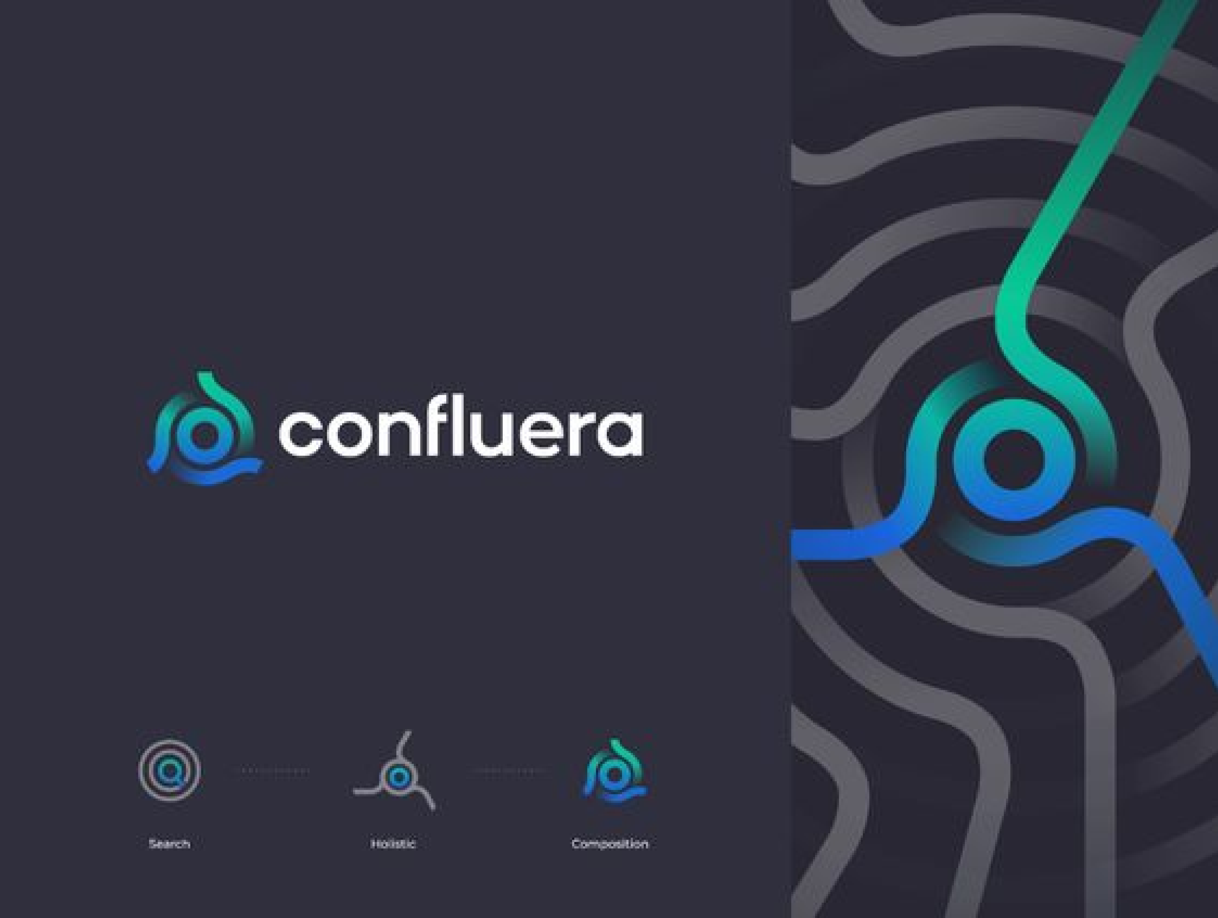
To integrate the connection with operations into the brand identity, the initial letter of the brand name was artfully aligned with a circle. This connection was mirrored in the logo design, layout and graphics, signifying the seamless nature of operations within the bank.
-
Logo: A clean, bold, and modern logo was designed by creatively manipulating the "T" to connect with the "S," representing the transformation from traditional to innovative practices and connecting solutions. The design resembles a circle, symbolizing the seamless nature of operations within the organization, while also integrating the brand's initial.
Fonts: The brand adopted a font combination of Amplitude and Avenir Next. Amplitude was chosen to anchor the brand to the legacy of J.P. Morgan, while Avenir Next emphasized the brand's modern software-as-a-service approach.
Color: The primary leading color for the brand was a vibrant blue, aligning with the branding of Asset and Wealth Management (AWM). Additionally, a vivid high-contrast version of blue was used to illustrate the fintech, start-up, and innovative aspect of the brand.
Imagery / Motion Graphics: CGI 3D render graphics were utilized to convey a sense of cutting edge, forward thinking, digital innovation, boldness, dynamics, and reimagined processes. The visuals represented the organization's commitment to leveraging advanced technology for a transformative and progressive approach in the fintech industry.
Layout: The brand incorporated a lo-fi layout that deliberately broke the conventional grid. Emphasis was placed on strong use of white space to introduce sophistication while countering the typical fun and casual aesthetics associated with software as a service. This layout approach complemented the serious tone of voice expected from an investment bank, revitalizing and modernizing existing guidelines for a contemporary and sophisticated appeal. -
The Heads of Asset and Wealth Management Operations (AWM) commended the workshops and the end results, expressing particular appreciation for the engaging motion graphics, a novel element within the bank. They have requested that the work be widely shared and utilized across the bank, showcasing the positive reception of the rebranding initiative.
RESEARCH


WORKSHOP


WORKINGS


FINAL DESIGN
-
The brand concept centered on the circle as a metaphor as the sun, the role operations plays within the bank, being the centre of the organisation or “universe” to allow all the planets to orbit in harmony. Additionally symbolising totality, protection, and perfection. Notably, a vibrant blue and engaging CGI 3D render graphics conveyed a cutting-edge, innovative aspect.
-
A clean, bold, and modern logo was designed by creatively manipulating the "T" to connect with the "S," representing the transformation from traditional to innovative practices and connecting solutions. The design cleverly resembles a circle, symbolizing the seamless nature of operations within the organization, while also integrating the brand's initial.
-
The primary leading color for the brand was a vibrant blue, aligning with the branding of Asset and Wealth Management (AWM). Additionally, a vivid high-contrast version of blue was used to illustrate the fintech, start-up, and innovative aspect of the brand.
-
The brand adopted a font combination of Amplitude and Avenir Next. Amplitude was chosen to anchor the brand to the legacy of J.P. Morgan, while Avenir Next emphasized the brand's modern software-as-a-service approach.
-
CGI 3D render graphics were utilized to convey a sense of cutting edge, forward thinking, digital innovation, boldness, dynamics, and reimagined processes. The visuals represented the organization's commitment to leveraging advanced technology for a transformative and progressive approach in the fintech industry.
-
The brand incorporated a lo-fi layout that deliberately broke the conventional grid. Emphasis was placed on strong use of white space to introduce sophistication while countering the typical fun and casual aesthetics associated with software as a service. This layout approach complemented the serious tone of voice expected from an investment bank, revitalizing and modernizing existing guidelines for a contemporary and sophisticated appeal.


WEBSITE DESIGN
The website design served as a brief, initial landing page for the brand, offering a concise overview of the organization and its value proposition.